Features
When visualizing and exploring your neoantigen candidates, pVACview starts by providing an overview of all variants used to predict neoantigen candidates. You can then investigate each variant in greater detail by breaking them down to the different transcripts that generate good-binding peptides. These transcripts then often each produce a different set of peptides that are predicted to bind well to certain HLA alleles. The individual MT/WT peptides can be further explored in terms of the distribution of binding algorithm predictions as well as anchor locations. Here below, we walk through the different sections of the pVACview explore page in detail.
Main aggregate report table
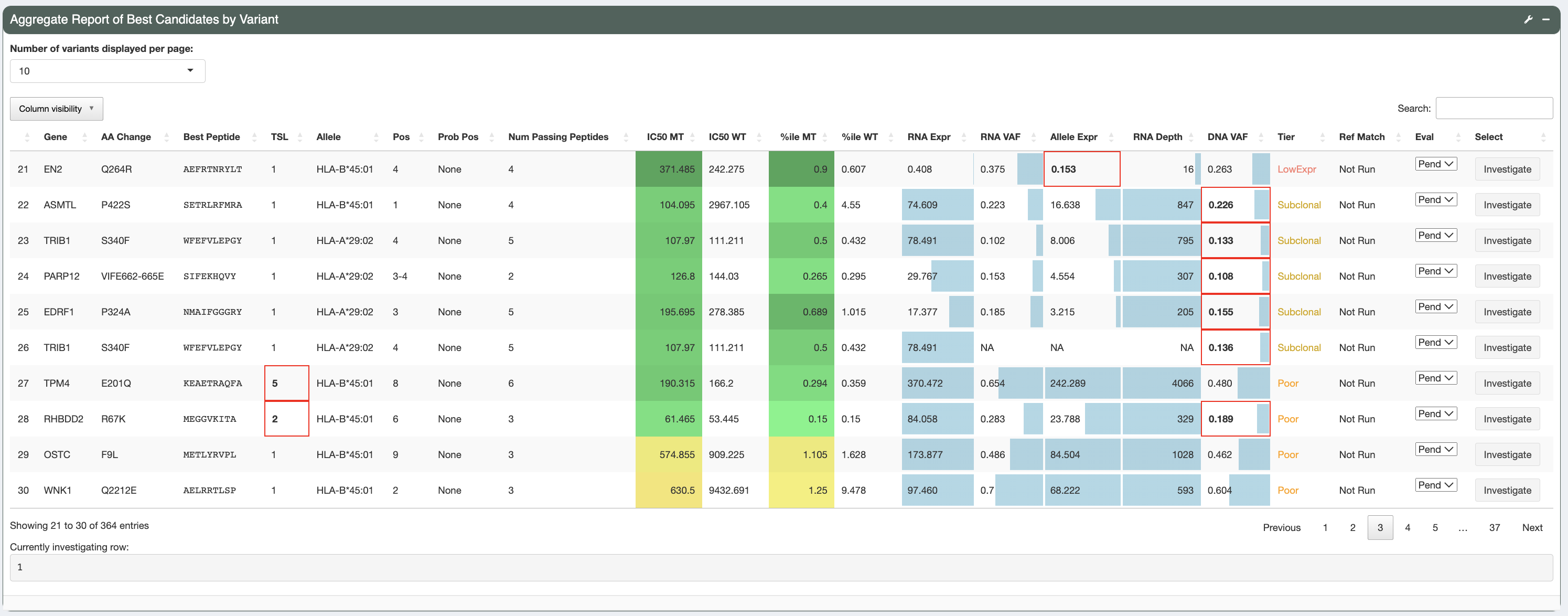
This is the aggregate report table generated as output from the pVACseq pipeline. The aggregate report summarizes the best-scoring epitope for each variant and outputs additional information specific to that epitope. It also provides information on a high level, showing the total number of well-scoring epitopes for each variants and transcript that cover them. There is a tiering giving to each variant based on a set of evaluation rules, helping you in prioritizing which variants to focus on first. Details on the report columns can be found here.
As shown, different cells of the report table are highlighted in various ways:
- IC50 MT, %ile MT, IC50 %ile MT, Pres %ile MT, and IM %ile MT columns:
The IC50 MT, %ile MT, IC50 %ile MT, Pred %ile MT, and IM %ile MT columns represent the median/lowest predicted IC50 binding affinities, combined percentiles, binding percentiles, presentation percentiles, and immunogenicity percentiles, respectively. Whether these columns contain median or lowest data depends on the value set for the
--top-score-metricin the original pVACseq run. Different background colors are used to give a general idea of where predictions fall in relation to their respective thresholds set:If a value is less than the respective threshold set it is colored with shades of green
If a value falls between its threshold and double its threshold it is colored with shades of orange
If a value is above double its respective threshold it is colored with red
Since no user-specified threshold for the (combined) %ile MT column is available, a hardcoded threshold of 2 determines this column’s background coloring to still allow for easy interpretation of the combined percentile compared to our default percentile cutoff.
- RNA expression, RNA VAF, Allele Expr, RNA Depth, DNA VAF columns:
These columns have bar graphs as cell backgrounds to give an idea where specific values fall across the entire patient sample:
RNA VAF and DNA VAF columns range from 0 to 1
RNA Depth ranges from 0 to the max depth across all rows
RNA expression ranges from 0 to 50. This is done in order to highlight expression values that are in the lower range, based on the reasoning that, for neoantigen candidates, when the RNA expression reaches a certain level it is considered expressed without the need to specify how high the exact RNA expression value is.
Allele Expression ranges from 0 to max of RNA VAF column multiplied by 50 (which is the max for the RNA expression bar graph range).
- Tier column and failing criteria:
The
Tiercolumn is colored based on the specific cell value with the Pass tier in green, the Poor and NoExpr tiers in red, and all other tiers in orange. Red cell borders are used to highlight values that did not pass filters and resulted in the tier given. For example, poor binders will have the IC50 MT and/or IC50 %ile MT columns outlined in red, depending on which value fails its threshold. A poor transcript will have the Transcript Pass column outlined in red if the transcript fails all of the criteria specified in the--transcript-proritization-strategy. This allows for easy identification of the criteria that are causing a candidate to be binned into its respective tier.
For more details on what each column represent, you can hover over the column names and/or click the tool icon on the top right where Help documentation is located.
Variant Information (Transcripts, gene info and evaluation overview)
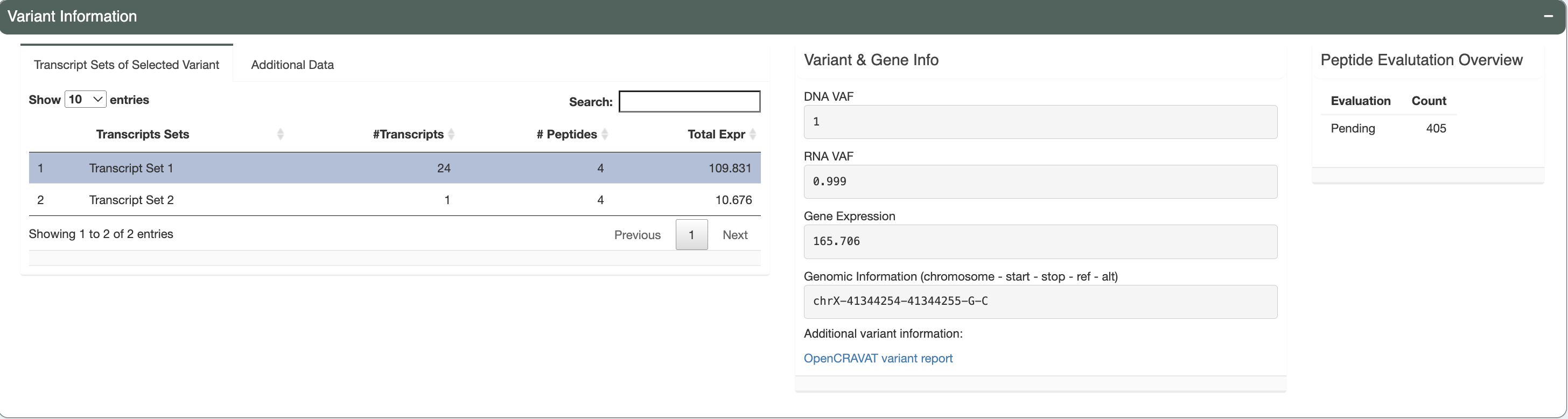
There are three separate boxes in this section as shown, from left to right you have:
Variant Information tabs
Transcript Sets of Selected Variant
The selected variant may have multiple transcripts covering the region. However, some transcripts might code for the same set of neoantigen candidates if the difference between transcripts is outside of the immediate area around the somatic mutation of interest. This table lists these different sets with the number of transcripts in each set, the number of corresponding peptides and the total expression of all transcripts in the set. The transcript set that includes the best peptide is highlighted in green and selected by default.
Reference Matches
If the reference proteome similarity feature was enabled during the original pVACseq run, this tab will show the Best Peptide, the larger peptide sequence around the Best Peptide that was queried for and it will list the hits that were found in the reference proteome for that query sequence.
Additional data
The data displayed in this tab is dependent on the additional data file that you provided in the
Uploadpage. The IC50 MT value and %ile MT values are shown if the app was able to locate the same variant in the data file provided. Values will show up as N/A if IC50 MT or %ile MT values are not provided in the additional file. Additionally, the Best Peptide of the variant from that file will be listed as well as the HLA Allele the Best Peptide prediction was binding to and the Best Transcript for the prediction.
Variant & Gene Info
This box displays the DNA VAF, RNA VAF, and gene expression values for the variant you have selected for investigation. The genomic information is provided in the format showing the chromosomal location of the variant for further variant analysis such as manual review. We also provide a link out to the variant report provided by OpenCRAVAT. This report will allow users to explore the variant with information regarding: variant annotation, cancer, population allele frequencies, clinical relevance, gene annotation, pathogenicity prediction etc.
Peptide Evaluation Overview
This box shows an overview of the current state of your evaluation choices (i.e. how many are marked accepted, rejected, or for review). Note that aggregate reports generated from the pvacseq pipeline defaults everything to
Pending.
Transcript Set Detailed Data (Peptide Information)
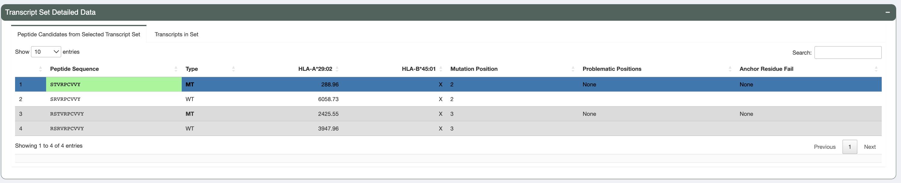
Peptide Candidates from Selected Transcript Set:
Upon selecting the transcript set for further examination, users can navigate to this table which displays all peptide sequences included for the transcripts in the selected transcript set in the transcripts table. Included peptides depend on the
--aggregate-inclusion-binding-thresholdand--aggregate-inclusion-count-limitspecified in the original pVACseq run. Both mutant (MT) and wildtype (WT) sequences are shown, along with binding affinities (where the MT binding passed the binding threshold). Whether this table shows mutant or lowest binding affinities depends on the value of the--top-score-metricsfrom the original pVACseq run.This table also shows for each peptide, whether there were any problematic positions and whether or not the peptide failed the anchor residue criteria for any of the HLA alleles. Peptides failing these criteria are deprioritized in the sorting of this table.
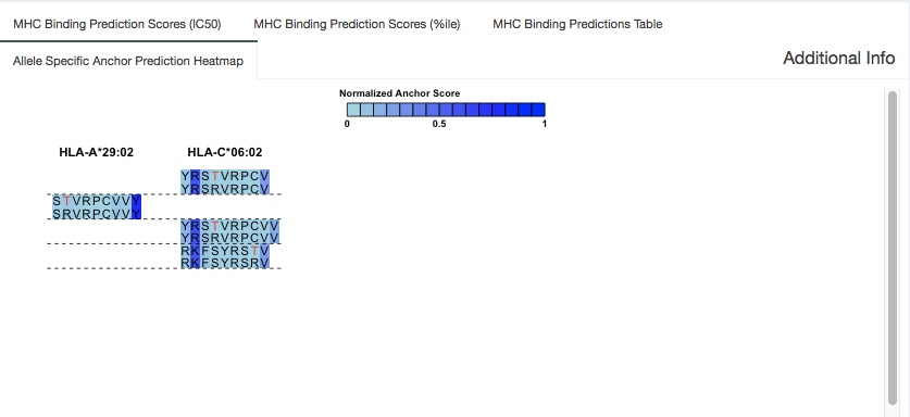
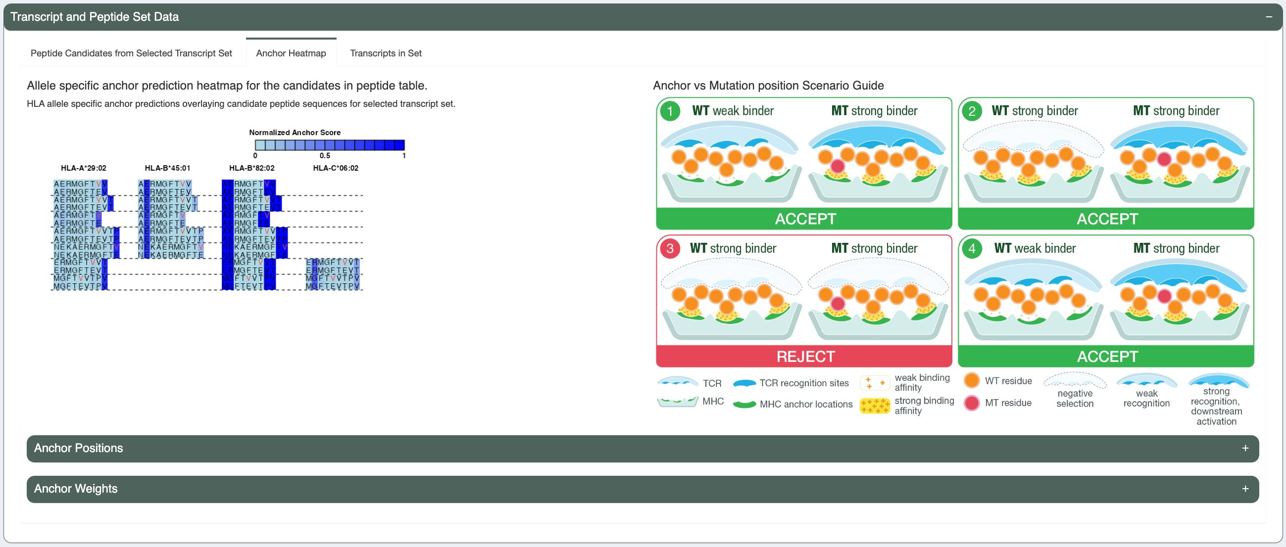
Anchor Heatmap:
Previously, our lab has computationally predicted anchor positions for different hla alleles and peptide length combinations (“Computational prediction of MHC anchor locations guides neoantigen identification and prioritization”). These predictions are normalized probabilities representing the likelihood of each position of the peptide to participate in anchoring to the hla allele. The peptide pairs from the peptide table are shown in this tab with anchor probabilities overlaying as a heatmap. These anchor probabilities shown are both allele and peptide length specific. The mutated amino acid(s) is/are marked in red (or the flanking ones are, in the case of deletions) and each MT/WT pair are separated from others using a dotted line.
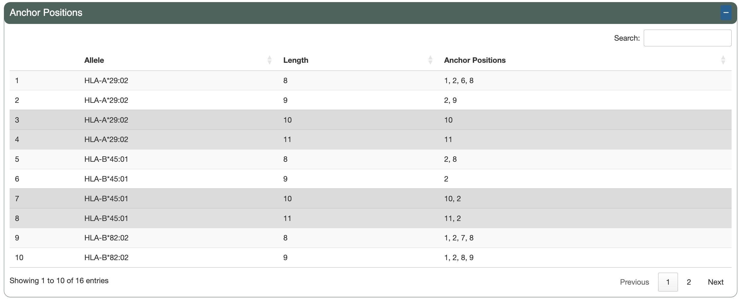
The Anchor Positions section shows a table of the per-allele, per-length anchor positions calculated from the anchor weights and the specified anchor contribution threshold.
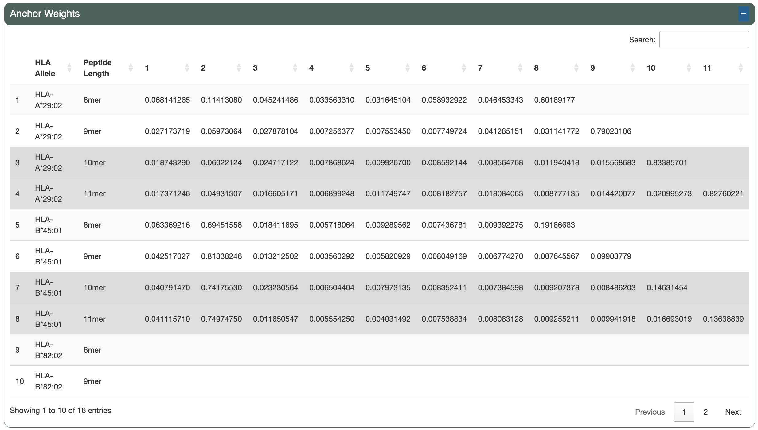
The Anchor Weights section shows a table of the per-allele, per-length anchor weights for each peptide position.
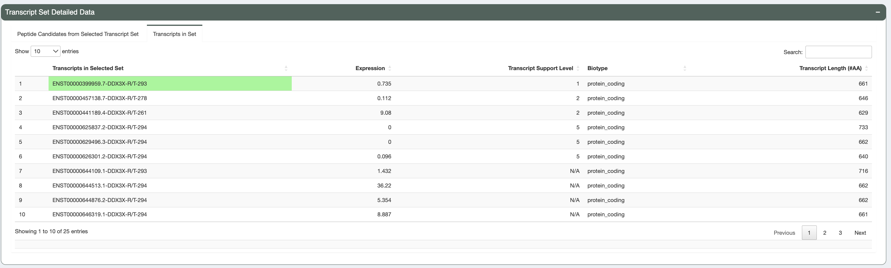
Transcripts in Set:
In this tab we provide additional information regarding the transcripts producing these peptides. This includes: Ensembl transcript id, individual transcript expression, MANE select status, Canonical status, transcript support level, biotype, CDS Flags status, and transcript length. Transcripts with a protein_coding biotype, no CDS Flags, that are the MANE Select or Canonical transcript, that have a low TSL, long length, and high expression are prioritized in the sorting of this table (in this order).
Additional Peptide Information (Additional information regarding individual algorithm binding)
There are four different tabs in this section of the app, providing peptide-level details on the MT/WT peptide pair that you selected in the peptide table.
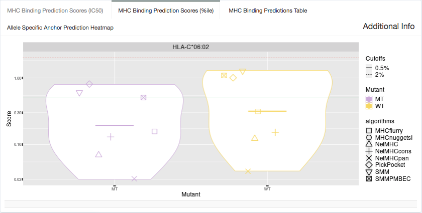
%ile Plot:
Shown in this tab are violin plots of the individual percentile-based binding, presentation, and immunogenicity predictions of the MT and WT peptides for HLA alleles that have predictions included in the aggregate report. These peptides each have up to 16 binding, presentation, and immunogenicity algorithm percentile scores for Class I alleles or up to 7 for Class II alleles. Binding percentiles are shown in blue, presentation in yellow, and immunogenicity in purple. The plot may be filtered to display only binding, presentation or immunogenicity percentiles by changing the option in the “Specify what data to show” dropdown.
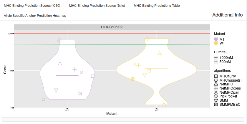
IC50 Plot:
Shown in this tab are violin plots of the individual IC50-based binding affinity predictions of the MT and WT peptides for HLA alleles that have predictions included in the aggregate report. These peptides each have up to 8 IC50 binding algorithm scores for Class I alleles or up to 4 IC50 binding algorithm scores for Class II alleles.
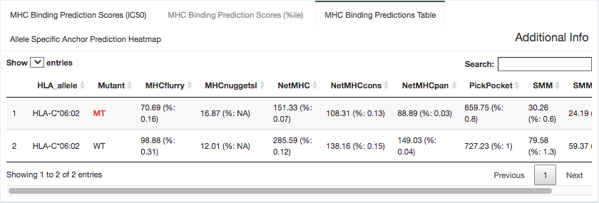
Binding Data:
Here, we provide the specific binding score and percentile binding affinity predictions generated from each individual algorithm. Most algorithms output an IC50 binding affinity, although some(e.g. MixMHCpred) output a more generic score. This table is shaded with a heatmap cell background to show where each value falls in relation to the specified binding affinity or percentile cutoffs. The “Cell heatmap background coloring” dropdown allows switch between these two options. This data is specific to the MT/WT peptide pair selected in the peptide table.
Presentation Data:
Here, we provide the specific presentation scores and percentiles generated from each individual presentation algorithm. This table is shaded with a heatmap cell background to show where each percentile value falls in relation to the specified presentation percentile cutoff. This data is specific to the MT/WT peptide pair selected in the peptide table.
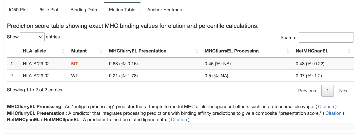
Immunogenicity Data:
Here, we provide the specific immunogenicity scores and percentiles generated from each individual immunogenicity algorithm. This table is shaded with a heatmap cell background to show where each percentile value falls in relation to the specified immunogenicity percentile cutoff. This data is specific to the MT/WT peptide pair selected in the peptide table.